I am down the rabbit hole and back from looking at DK/Sport weight sweaters for my recent stash enhancement. I was flipping through pages and pages of results when Joji Locatelli’s Radiate practically jumped off the screen at me. It’s a top down yoked sweater with a two color slipped stitch design in the yoke. I bought the patter on the spot.
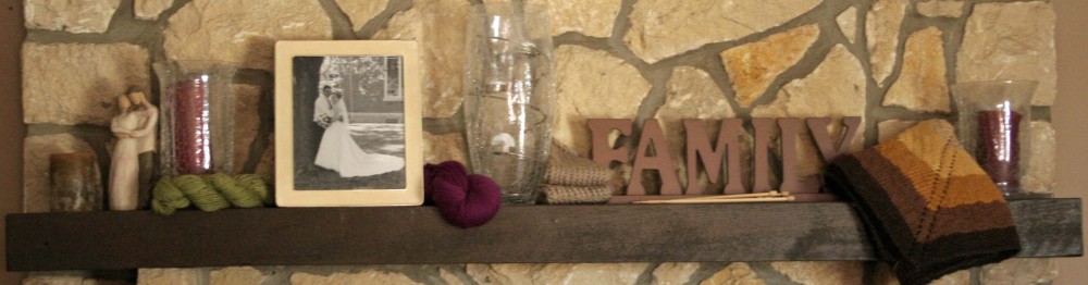
Then I jumped to my stash and dug out all my superwash merino DK yarn to find a contrast color. I found three, a Treasure Goddess DK skein in a Merlot wine color, a Blueberry Chick yarn in a Lilac color and finally a Moonstone Dyeworks DK yarn in honey color.

Because I have been burned before, I pulled out my phone and took a black and white photo. Immediately this eliminated the wine color because it does not have enough contrast.

The lilac and honey both contrast nicely. But I’m left really having to decide if either of those two colors are really what I want. I don’t have a specific color in mind. I’m just not 100% sold that either of those two are “it”. I need to do some pondering….I really want this sweater to be SHARP.
I need to gauge swatch anyway. I might start swatching and work in both colors without cutting the yarn to see what they look like? Or I may pull up the pattern page and look at what others have done. Or both….bwhahahaha!
Happy knitting!!

That gold and lavender are really going to be lovely together. I can’t wait to see your final color combo!
Both are lovely. My vote would be with the lilac, but you have the right idea to swatch and see.
ooh I never thought of photographing in B&W to highlight contrasts. I will have to try that.
will have to try the black and white trick
Pingback: More Radiate Options | My Tangled Yarn Knitting Adventures
I like your idea of taking a photo in black and white. Never heard of that before.